

Have you ever read a book only to get to the end and throw it against the wall in a…
Read MoreOur Favourite App Explainer Videos Examples
Congrats! Your brand has an app, and it’s looking great. Unfortunately, your app’s download numbers are…well, the opposite of great.
Does that mean your brand’s app is bad? Not necessarily. Your app may be exactly what your customers want—and need!
They just don’t know that yet.
So, what’s the best way to loop your audience into what your app offers?
Enter: the app explainer video.
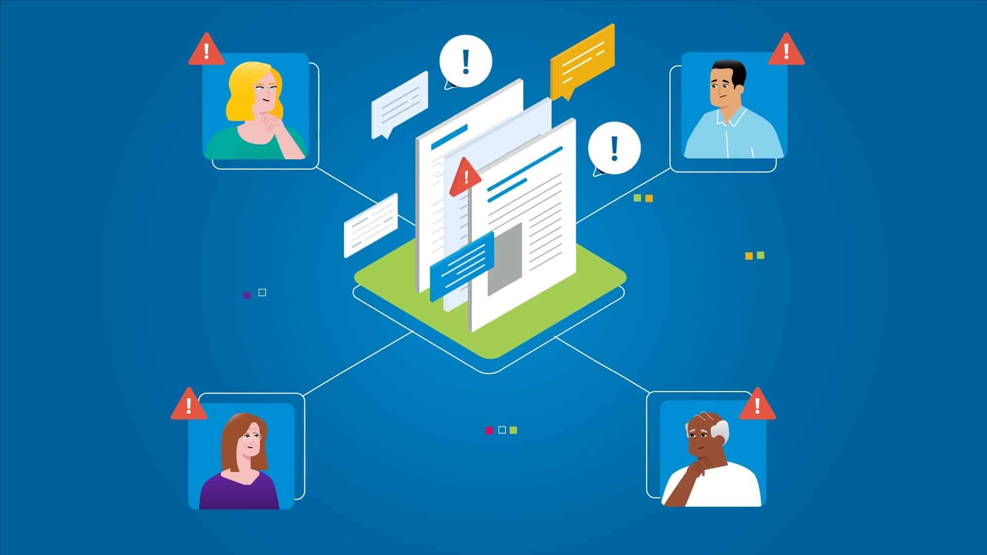
Fight App Fatigue the Smart Way
“There’s an app for that.” Apple’s 2009 iPhone ad catchphrase seemed dramatic—and ripe for parody—at the time. But today, it’s barely an exaggeration.
There are approximately 2.22 million apps on the App Store. And, as of 2021, Google’s Play Store has Apple beat with 3.48 million mobile apps on offer.
Mobile app technology has evolved in the last decade. Today’s apps deliver content, connection, commerce, and personalised information unlike any medium before.
No wonder the global mobile app market is worth $154 billion (AUD 206.71 billion)!
Yet, technological advances also accelerate confusion. Complexity and decision fatigue have made users less keen about apps overall. This waning enthusiasm is so widespread, tech journalists came up with a term for it: app fatigue.
App fatigue describes customers who feel overwhelmed by mobile apps. They feel there are too many, and they take too long to learn to use, for it to be worthwhile to download anymore.
Since 2016, surveys indicated a growing segment that finds new apps cause more stress than they alleviate. Rather than mess with notification settings and permissions again, many want to stick with apps they already use and trust.
A great app explainer video can demonstrate how your app’s value is truly worth your customer’s while.

What Makes an App Explainer Video Great?
App explainer videos increase the rates at which customers download an app. They’re effective because they answer two questions:
- Which of my problems does this app solve?
- How easy is it to use this app to solve that problem?
Once you’ve answered these two questions, you’ve done 90% of the work necessary to combat app fatigue. The best app explainer videos answer these questions clearly, succinctly, and in a memorable way.
App explainer videos shouldn’t be longer than ninety seconds. Many are less than thirty. So, how do you communicate the answers to those questions in that short window?
And, how do you keep your message memorable enough to compel conversions? The average internet user sees anywhere from 4,000-10,000 ads each day. What keeps people from tuning yours out?
These are questions with a variety of possible answers. Rather than go through each possibility and weigh the pros and cons in the abstract, let’s explore something more concrete.
Let’s examine some of the most engaging app explainer videos on the internet. Then, unpack them for inspiration. What are the developers doing to make the videos compelling?
Here are the key takeaways from some of the most memorable app explainer videos.
What is Pinterest? (Pinterest)
https://www.youtube.com/watch?v=t8q8YjgmolU
Last year, Pinterest had a problem. Downloads of the Pinterest app had slowed, and it had an outdated reputation as a vision board site for suburban moms.
So, the company created this app explainer video. In an unusual move, there’s no voiceover. Instead, the story is told succinctly through text, music, and images.
The music and design elements are fun and youthful. The copy used simple sentences to show people what makes Pinterest a different—and better—eCommerce solution.
Specifically, it uses machine learning algorithms called “neural networks.” These networks have been highly trained by the past decade’s worth of Pinterest users who sort images into categories they actually use.
Pinterest also makes it easy to reverse image search and to buy what you see. Pretty far from the Pinterest of 2011!
Pinterest’s Strategy
Pinterest focused on targeting an audience that would benefit from their app but had misconceptions about it. Specifically: younger women, racially and culturally diverse people, and tech enthusiasts.
By choosing to skip the voiceover, the viewer can mentally interpret the text in a voice that makes sense to them. This made this video inclusive to a wider audience.
Moreover, the text and images specifically showcased racially inclusive searches. It demonstrated a user searching for makeup applied on different skin tones.
Overall, the focus was on the images. There were about three times more frames showcasing images than text in the video.
Moreover, the text supported the video. When the video displayed image searching, the text described Pinterest’s precise, wide-ranging search categories.
It didn’t say, “you can search with images.” The video showed that, so the text was free to support, rather than repeat, that information.

Key Takeaways
What can you learn from this app explainer video? Think about:
- Targeting specific audiences
- Choosing audience-specific messaging, vocabulary, and style
- Conveying information with images and music as well as speech
- Highlighting your key differentiator and why it matters
Top Ten: Consumer App Explainer Video (Nielsen)
https://www.youtube.com/watch?v=yyxXIC6hcVA
Nielsen Holdings is a media market research firm. The company is best known for its Nielsen ratings. These ratings say how many people have watched a specific TV show in a given week.
Most of Nielsen’s products are B2B. So, when it launches its first-ever consumer-focused product, Nielsen created an app explainer video.
Top 10 App Explainer
Nielsen’s Top 10 app gives people instant access to top ten lists in every media category. It also gives users opportunities to share their data and join Nielsen panels (focus groups).
The explainer video uses a female American actor to read the voiceover, which is warm and professional.
The footage shows people using the app in social situations, like hanging out at a cafe, and when they’re relaxing independently at home. The music is upbeat without being overwhelming.
Key Takeaways
Nielsen’s app explainer video mixes stock footage and footage of the app. The two types of footage blend seamlessly. From this video, you might consider:
- Saving money by using stock footage, without looking generic
- Casting a warm, authoritative voice actor
- Emphasizing the opportunity the app gives your audience
JoyScore App Explainer Video (JoyScore)
https://www.youtube.com/watch?v=u3Wo5m71upQ
At 48 seconds, the JoyScore app explainer video is one of the shortest on this list. Yet, it’s clearly compelling and effective.
JoyScore is a wellness app. It helps users reach their mental, physical, and overall life wellness goals.
The video begins with upbeat “spa-style” piano music and tinkling chimes. The warm sunrise peach background blooms into the JoyScore logo. Then, the voiceover narration starts.
Unlike Pinterest and Nielsen, JoyScore is a startup. So, the narrator jumps straight to telling viewers what the app is: “Welcome to JoyScore, the app that helps you improve your joy on levels of mind, body, and life.”
The video shows illustrated renditions of the JoyScore interface, as the narrator describes how the app helps you get to know your inner self with simple questions.
The illustrations use a washed-out, watercolour-like primary colour palette.
The video highlights the app’s key features, like the mood tracker. And, it show’s the app’s mood-improving offers (activities and challenges). Throughout the video, the narration is soothing and calm.
Interestingly, there are no human characters in the video. Instead, the artistic, animated rendering simulates the experience of the viewer using the app. The viewer is the “protagonist” of the video.
JoyScore’s Audience Conception
The way JoyScore seems to conceptualise its audience is interesting. It appeals to people who feel that their mood is low, and those who want more joy in their life.
It doesn’t pretend to be a healthcare treatment. The narrator’s copy uses spiritual language like “fountain of joy.” Yet, the copy stays relatively neutral, without leaning too far into any specific religion, philosophy, or framework.
This feels inclusive. The inclusive sense is reinforced by the voice actor. The narrator is calm and soothing.
Unlike the Pinterest video explainer, this video cultivates a tender atmosphere. It ends on a note that feels more like a call to reflection than a call to action.
Key Takeaways
The JoyScore explainer video uses an interesting approach. Here are some elements you may want to take and apply to your video:
- Make the viewer the “protagonist” by framing shots in the first person
- Convey a sense of relief or well-being rather than excitement
- Use a limited colour pallet to cultivate the right mood
- Focus on what the app does for the viewer, rather than on how it works
- Keep it simple
Safe Travels – The Ultimate Travel App – Explainer Video (Safe Travels)
https://www.youtube.com/watch?v=hl8gdEgm4uI
One of the best examples of an animated app explainer is this Safe Travels video.
Safe Travels is an app that helps people stay prepared for emergencies when they travel abroad. In the explainer video, a narrator describes how the app works, while an animated character goes through a dramatic adventure.
The Safe Travels app gives users a way to save and share critical information—like passports, medical information, and insurance IDs—with their companions temporarily.
This lets groups of travellers keep each other safe, and helps everyone move through medical or bureaucratic systems faster when the unexpected happens.
Animated Adventure
The Safe Travels app explainer video uses a male Australian voice actor who sounds confident and fun. Most of the video is animated.
In the video, a simply-drawn, amiable-looking man is the protagonist. Throughout the video, he runs with bulls, swims in the ocean, and eats street food.
Then, he gets injured, sick, and gets his wallet stolen from him in different segments. He’s in the hospital. The voiceover narrator describes how this could be dangerous if a person cannot access vital medical or personal documents.
The protagonist can get help from his companions—the narrator describes them as “new friends and relative strangers”—because he has the Safe Travels app.
The video shows actual images of the Safe Travels app user interface. It contrasts with the animated style of the rest of the video—particularly because it shows the profile photos on the app.
The Safe Travels app lets the protagonist share these documents ahead of time, and store them offline. Then, the video describes the app’s other helpful features.
All the features help travellers coordinate and communicate with one another.
Key Takeaways
The Safe Travels app explainer video is one of the longer videos. Fortunately, it stays watchable the entire way through.
The story told through animation engages the viewer more than the narrator’s information would alone. Here are a few things this explainer did that you might use in your own video:
- Illustrate what the narrator describes in a surprising, funny way
- Show the app’s actual UI when highlighting features
- Get specific about risks and solutions
The animation choices in this video stand out. It’s more memorable to see a character get injured while running with the bulls than sustain an injury while hiking.
Regarding that last point, the explainer outright states travellers risk “life-threatening reactions to medicine” when they travel without easy access to medical documents. That’s a concrete, vivid risk that the app mitigates.
Vested Mobile App – Explainer Video (Vested Networks)
https://www.youtube.com/watch?v=tG0M_qwO6cE
The Vested mobile app explainer video targets an audience seeking to build generational wealth. The app empowers users to save money, invest, and work towards financial goals.
The explainer video doesn’t incorporate any characters. Like the JoyScore video, this video speaks directly to the audience. But, unlike JoyScore’s video, Vested uses a clean, bold aesthetic.
The lettering and graphics stick to a simple, complementary colour palette: forest green, pale pink, and white. One still image includes a model holding a smartphone with the app displayed on it.
The lettering and graphics choices reflect the financial institution’s professionalism. The first-person perspective focuses on the viewer.
Investment In Your Pocket
The Vested app explainer video has pleasant background music. The narrator is an encouraging yet business-like voice. The video utilizes animated lettering and graphic transitions to move through each scene.
This helps keep the written information memorable. The entire content is eight simple sentences. The visible text restates what the narrator says in the simplest possible terms.
The first sentence tells the viewer what the app does, and assumes that’s exactly what the audience wants to do.
Then, three sentences tell the viewer exactly what to do: download the app, enter your email address, and verify your account. The last four sentences highlight four key tasks the app streamlines.
Key Takeaways
This video explainer demonstrates how effective minimalism can be. Consider applying these less-is-more tactics to your video:
- Keep your script incredibly short, 100 words or less
- Spend almost half of those words on your call to action
- Emphasise your main point by revealing text with fade-in effects
- Use a limited colour palette
Neat Streets App Explainer Video (NeatStreets)
NeatStreets is an app that empowers community members to discover and fix problems in coordination with city officials.
Users can take pictures of potholes, burnt-out streetlights, and other public hazards, then report them to the right department with a few clicks. It makes it easy to maintain public space.
The NeatStreets app explainer video is entirely animated. The protagonist is a bicyclist with a blue helmet.
The video displays the protagonist’s problem clearly in the first five seconds. Then, it uses the remaining 25 seconds to show how the app solves the problem better than current alternatives.
Short, Simple, Smart
The NeatStreets explainer video is one of the shortest videos on this list. Yet, it still tells an interesting, simple story without straying from the point.
The animated design is rounded, friendly, and simple. The bicyclist has a blue bike and outfit, which makes him easy to follow, visually, against the olive-green and grey backdrop.
There’s a warmth to the video’s tone, but it never pushes into an overly-cheery territory. The narration is straightforward.
The clarity of the copy pushes against everything people hate about bureaucracy. This highlights the contrast between the NeatStreets app and the slow conventional methods of contacting city officials about public hazards.
Key Takeaways
The NeatStreets app is trying to capture a broad audience. As a result, keeping things warm, clear, and easy to follow is a useful strategy. Here’s what you might want to apply to your video explainer:
- Simple character design
- Use colour and opacity contrast to make visuals easy to read
- Convey the problem in one sentence
Embark – Your Global Public Transport App (Contact Light)
https://www.youtube.com/watch?v=9CweP9bxT2g
Embark is an all-in-one public transportation app.
Users can determine the best way to get where they want to go based on their personal preferences. They can choose routes that encompass multiple modes of transportation, or just one.
It also does more than that. The Embark app helps users stay entertained and connected. It offers price comparisons for nearby restaurants and retailers, and it helps users meet their fitness goals by tracking their steps.
In 2016, Contact Light released an explainer video for the Embark app. The animated video explored the app’s features and simulated the experience of using the app.
One App, Every Trip
The video uses an incredibly vibrant animation style. The scenes switch between those that treat the viewer as the protagonist and third-person shots that zoom out on the route.
Contact Light chose to spend most of the video’s length highlighting the app’s many features. The narrator sounds like a fun friend rather than an authority, and he notes each feature with enthusiasm. It’s an interesting choice.
Key Takeaways
This explainer video underscores how all-in-one the Embark app is. While it’s usually better to focus on the problem and your solution, this is a rare instance where highlighting the sheer breadth of features can pay off.
If you have an app with many features, consider applying these concepts from the Embark video:
- Fast pace
- Vibrant colours
- Casual, enthusiastic narration
Making Explainer Videos: Q&A
Fundamentally, app explainer videos aren’t too different from any other explainer video on the internet. The catch is, they need to be shorter. And, they drive a specific type of conversion: app downloads.
Here are some of the most common questions people ask about making these videos.
How Does a Brand Make an App Explainer Video?
Most marketers follow six steps to make an app explainer video. The steps are:
- Create a content plan
- Draw a storyboard
- Write a script
- Record the voiceover
- Film or animate the video
- Edit, polish, and upload
In this case, your content plan will tell you the target audience for the video and key aspects of their profiles. How do they speak? What are their pain points?
The content plan also articulates the key goals of the video. Do you want to earn 1000 downloads in one week? Or, is the video meant to be more evergreen?
Explainer Videos vs App Demo Videos
Explainer videos are slightly different from app demo videos. Explainer videos are concise. They only tell the audience what problem the app solves, and how the solution works.
App preview videos are longer. These videos showcase the app’s features and specs.
If you want to explore some app preview video examples, check out our portfolio. Some of our clients enjoy demos of their products or services, while others prefer different video marketing options.
What Challenges Do Brands Face When Making These Videos?
When a company tries to make an app explainer video, it’s likely to face a few challenges. First, there’s the challenge of coming up with truly creative, memorable copy and characterization. Creativity is a skill!
Second, there’s the challenge of staying under budget. Trial-and-error can drive up production costs surprisingly quickly. One of the best ways to stay in the black is to work with a professional marketing agency.
Make An App Explainer Video That Converts—Today!
An app explainer video can make downloads skyrocket. But, that’s only true if your audience watches it.
There are plenty of app explainer videos to take inspiration from. Yet, as Thomas Edison said, “Genius is 1% inspiration and 99% perspiration!” What kind of effort will it take to bring your genius app explainer idea to life?
It’s easy to make some costly mistakes when you make videos. Fortunately, if you work with experts, it’s possible to work smarter rather than harder.
At Punchy Digital Media, we know what works. How can we make it work for you?
If you’ve got a killer app, and you want video marketing for it, we’d love to hear from you. Contact us today, and we’ll talk about how you can make app download rates soar.