Have you ever read a book only to reach the final chapter and feel utterly disappointed? Or left the cinema…
Read MoreHow Universities Use Video to Drive Real Student Action
When communicating with today’s university students, you are competing with every other source fighting for their screen time.
Attention is brief and easily lost, which means video cannot be passive or decorative. It has to work hard and it has to work quickly.
That is why video can no longer be treated as a box-ticking task. It needs to be a core part of a university’s communication strategy, designed to drive a clear action in the short time it has to engage a viewer.
From guiding students through enrolment to helping them picture university life, the most effective institutions are creating purpose-built videos that turn passive watching into active decision making.
We have analysed five of our own university video projects that show how this approach works in practice.
Monash University
The Challenge
International and domestic students often struggle to navigate language placement tests and enrolment pathways.
The Approach
Our animated explainer replaces dense policy documents with a clear, step-by-step walkthrough.
What the video does well
- Breaks the process into simple, actionable steps.
- Uses soft colours and friendly illustrated characters to make administrative tasks feel less intimidating.
- Shows system mockups of Allocate Plus and Moodle so students can picture the process.
- Normalises common anxieties and reinforces that support is available.
- Ends with a clear next step to increase confidence and follow-through.
Why it works
The video removes cognitive load by showing rather than describing. Students do not need to interpret complex documents and can simply follow the visual journey. The approachable design and consistent Monash branding build trust and help viewers feel supported rather than overwhelmed.
The Design Principle
When you need audiences to complete multi-step processes, video can reduce friction and increase follow-through by showing rather than telling. Animation, in particular, can make administrative content feel less daunting and more accessible.
UNSW
The Challenge
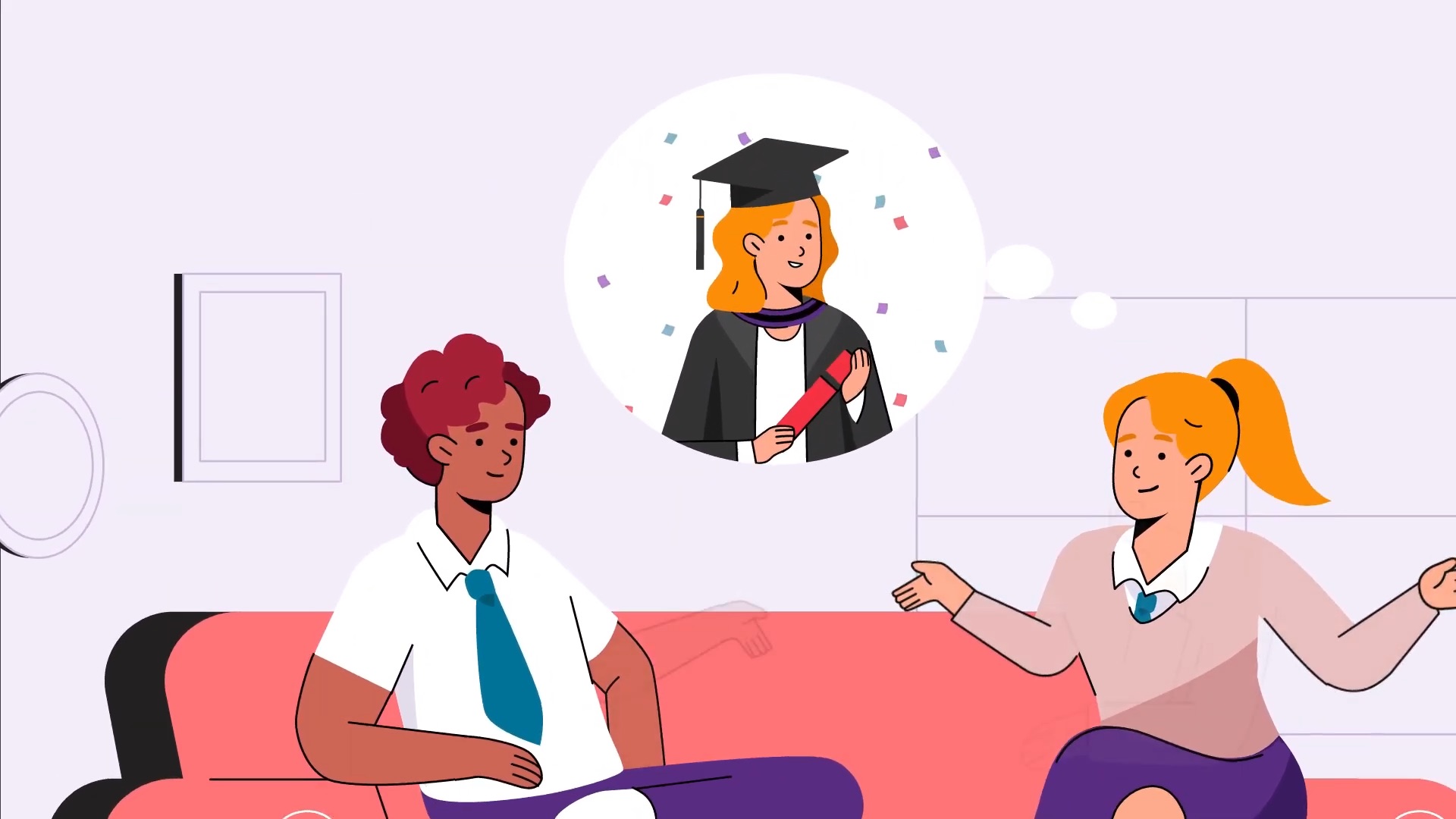
Law degrees are highly competitive. Prospective students need more than course details. They need to understand how the degree will shape their identity and future career.
The Approach
We designed a series of recruitment videos to help students picture themselves studying law at UNSW and taking the first step toward becoming practising lawyers.
What the video does well
- Anchors the message in aspiration rather than information.
- Highlights 26 double-degree options and practical experience through community legal centres.
- Uses strong UNSW branding throughout to build familiarity and trust.
- Features campus imagery and real students to create emotional connection and help viewers imagine themselves there.
- Frames the call to action as a personal challenge: What difference will you make?
Why it works
The video shifts the focus from course features to personal identity and aspiration. Strong branding, real student imagery and a clear value proposition build credibility. The closing question invites self-reflection and acts as a subtle yet powerful call to action. Students walk away feeling that choosing UNSW is choosing their future.
The Design Principle
For competitive programs, show prospects not only what they will study, but who they will become. Let them see themselves in the story.
Western Sydney University
The Challenge
In a saturated field of environmental science programs, how do you attract students who want to make a real impact?
The Action
We created an animated explainer that positions the Bachelor of Science majoring in Sustainable Environmental Futures as the standout choice.
What the video does well
- Leads with a clear differentiator of global number one ranking for University Impact Ratings.
- Highlights program flexibility and the ability to design a personalised degree.
- Showcases world-class facilities, including the Hawkesbury Institute for the Environment.
- Uses a soft, optimistic colour palette and clean animation style that feels professional and trustworthy.
- Features diverse and relatable characters working across real environmental settings, reinforcing the program’s hands-on nature.
- Demonstrates the program’s breadth, from agriculture to technology, in ways that would be difficult to capture with live footage alone.
Why it works
The video answers the central student question: Why choose this program? It presents a clear, credible value proposition backed by rankings, facilities and future pathways. Viewers finish with a strong sense of the program’s purpose and where to go next.
The Design Principle
When your audience has options, lead with what sets you apart and show the future they can pursue. Animation helps communicate scope and possibility in a way that feels inspiring without overwhelming.
Flinders University
The Challenge
Research impact often feels abstract. How do you show that university research addresses real problems affecting everyday Australians?
The Action
We created this animated explainer that demonstrates how community voices shape Flinders University’s research priorities.
What the video does well
- Opens with community input, showing that insights from 30,000 Australians drive the research agenda.
- Presents the top five problems, such as inflation, healthcare and climate change, in a way that feels relevant and urgent.
- Positions Flinders researchers as collaborators working with government, industry and community groups.
- Uses clear and accessible messaging to connect national challenges with the university’s research efforts.
- Reinforces the idea that Flinders is guided by public priorities rather than academic isolation.
- Concludes with a strong call to action inviting viewers to engage with the full report.
Why it works
The video makes research tangible. By starting with issues Australians already care about, it shows that Flinders listens, responds and applies its research where it matters. This builds trust and positions the university as a partner in solving real-world problems.
The Design Principle
When communicating research impact, begin with challenges your audience recognises. Show them their input shapes the work, then invite them to explore the findings in more depth.
Western Sydney University
The Challenge
Aboriginal and Torres Strait Islander students may not see themselves in higher education or understand what university can offer.
The Action
We created a culturally respectful explainer that encourages students to explore and register for Pathways to Dreaming.
What the video does well
- Meets students where they are, acknowledging uncertainty and making participation feel achievable.
- Shows relatable student experiences across school, campus and future pathways.
- Offers multiple ways to join the program, reducing practical and emotional barriers.
- Incorporates Indigenous design elements, such as dot patterns and symbolic motifs, in a way that honours culture without tokenism.
- Depicts students in varied academic and career contexts to help viewers imagine their own futures.
- Clearly explains the program’s purpose: building confidence, increasing cultural safety and opening doors to new opportunities.
Why it works
The video builds trust by centring Indigenous students and their experiences. It replaces abstract promises with relatable stories, respectful visual cues and a clear pathway forward. By showing students like them, in environments they can picture themselves in, it normalises uncertainty and replaces it with possibility.
The Design Principle
When reaching underrepresented audiences, show people like them in the experience. Honour cultural identity, address concerns early and make the next step feel both welcoming and achievable.
Key Lessons About Purpose-Driven Content
Across these five examples, several patterns emerge:
- Clarity Leads to Action
Each video delivers a direct and simple next step. Viewers know exactly what they should do, which removes hesitation and increases follow-through. - Visual Strategy Matches Purpose
Design choices are intentional and aligned with the goal. Animation, colour, pacing and imagery are all used to reduce anxiety, inspire ambition, build trust or communicate complexity in a clearer way. - Audience Context Shapes the Message
The strongest videos start from the viewer’s reality. They acknowledge concerns, motivations and barriers, then respond with information that feels relevant and supportive. - They Show, Not Just Tell
Rather than relying on abstract explanations, the videos demonstrate processes, environments and outcomes. This helps viewers picture themselves in the experience and understand what participation looks like. - They Remove Friction
Potential obstacles are addressed early. Confusing steps are clarified, options are simplified, and reassurance is built in. The result is content that feels easy to engage with and act on.
Next Steps
As you finalise your 2025 budgets, consider where purpose-driven video could help your institution turn awareness into action.
Whether you’re looking to streamline administrative processes, recruit for competitive programs, communicate research impact, or build pathways for underrepresented students, the principles remain the same: know your audience, remove barriers, and design with a clear action in mind.
If you’d like to discuss how we can help bring your institution’s strategic goals to life through video, we’d love to hear from you.