Have you ever read a book only to reach the final chapter and feel utterly disappointed? Or left the cinema…
Read More8 Design Lessons to Make Your Visual Content Accessible to All

Over 40% of Australians have literacy below what’s needed for everyday life. That’s over 7 million people.
At Punchy, our mission is to empower communities across Australia through visual communications. We know you can’t do this if your content isn’t accessible in the first place.
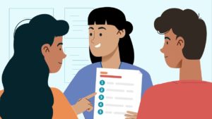
This November, Anthony Lam hosted a webinar with Sean de Kretser and Fiona Chen from Australia’s leading accessible communications agency, Information Access Group.
They walked through real case studies and shared essential principles for creating content that’s seen, understood, and acted upon by all Australians.
Watch the full webinar recording here
Below, we’ve distilled their insights into eight practical lessons you can apply to your next campaign.
Lesson 1: Co-Design from Day One, Not as an Afterthought
The most important lesson in accessible design: incorporate accessibility from the very beginning.
Retrofitting accessibility after content is created is expensive, time consuming, and often less effective. When you build accessibility in from the start, it becomes seamless rather than obvious.
The Information Access Group’s website project for Inclusion Australia exemplifies this approach.


They consulted with the community through co-design and tested the website through multiple workshop rounds. At each stage, accessibility was woven into the fabric of the project.
The final website uses styles consistently throughout.
- Images and graphics create breathing room
- All colour contrast was verified with checking tools
- All text meant to be read appears in high contrast black
- The typeface is inherently accessible
- Images are clear and respectful of the audience.
Lesson 2: Layout is the Foundation of Everything
Good layout is where accessible design begins. It’s the structure that supports every other element.
A Victorian Country Fire Authority video demonstrates this perfectly. Even when played in Vietnamese, the message remains crystal clear, because the design doesn’t rely on language comprehension alone.
Effective accessible layout means creating screens that are easy to navigate, particularly helpful for people with cognitive disabilities.
The flow of content should be predictable. When you use numbered lists or bullet points, you’re giving viewers a visual roadmap of exactly how information should flow.
Clear headings act as signposts. Generous negative space, that seemingly empty area around your content, isn’t wasted. It gives viewers mental breaks between pieces of information, preventing cognitive overload.
The key is avoiding decorative flourishes that distract from the core message. Every design element should serve a purpose.
If it doesn’t help communicate your message, it’s working against you.
Lesson 3: Imagery Must Speak Universally
Keep imagery simple. Avoid embedding text in images because it increases cognitive load and becomes illegible at small sizes, particularly on mobile devices.
Colour contrast in imagery deserves careful attention. Make images large enough that each detail remains visible. Style consistency throughout your content helps audiences learn your visual language and recognise forms and concepts more easily.
When The Information Access Group worked with the Domestic, Family and Sexual Violence Commission on their 2025 yearly report, they used customised icons consistent with the organisation’s branding.
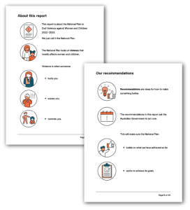
In just one month after publication, the standard version was downloaded over 800 times and the Easy Read version over 150 times.
For content about such a sensitive topic, those Easy Read downloads represent over 150 people who might otherwise have struggled to access critical information about their rights and support services.
Lesson 4: The Difference Between Plain Language and Easy Read
There’s often confusion between plain language and Easy Read. They serve different purposes and audiences.
Plain Language
Plain language focuses on message clarity. It removes jargon, acronyms, buzzwords, and complex information. It strips away fluff and gets straight to the point. The audience might be the general public or specialists in a field.
Most guidelines suggest aiming for a Year 7-9 reading level.
Easy Read
Easy Read focuses on simplicity. It uses large font sizes and abundant white space. Each sentence contains only one idea. Where appropriate, images support the text. Easy Read is used extensively for audiences with disability, but it’s also becoming widely used for audiences with low literacy levels in First Nations and multicultural communities.
The reading level typically sits at Year 3-6, sometimes dropping as low as Year 2 depending on the content and audience needs.
Lesson 5: Colour Contrast Goes Beyond Black and White
Colour contrast often gets reduced to a simplistic understanding: use blue and orange for colour blindness. This misses the point entirely.
Colour contrast is about how two colours sit together and whether the contrast between them is strong enough to see.
Black and white has excellent contrast. Yellow and orange together? Almost impossible to distinguish for many people.
A video produced for Cancer Council NSW demonstrates this principle beautifully.
Created for people affected by cancer with low literacy and potential intellectual disabilities, every illustration features dark outlines. This means lighter colours remain visible even for people with colour blindness or low vision.
The content needs to work for people facing intersectionality: someone might be elderly, from a multicultural background, and have declining vision.
Colour contrast addresses multiple barriers simultaneously.
Lesson 6: Typography Details Make or Break Readability
A Stroke Foundation video for stroke survivors and their families shows typography done right.
The fonts are clean, simple, and spacious. This isn’t about aesthetics. It’s about function.
Sans serif fonts generally work better for accessibility because they lack decorative elements that can confuse the eye. Each letter remains distinct and clear, crucial for people who are neurodivergent or have visual impairments.
- Size matters: Text smaller than 12 point for print or 18 pixels for digital creates unnecessary barriers. If someone has to squint or zoom to read your content, you’ve already lost them.
- Avoid writing in all capitals: The uniform letter height actually reduces reading speed. For someone with visual impairment, caps can appear as uniform blocks, making individual letters difficult to define.
- Minimise italics: The slanted angle makes text harder to read, particularly for people with dyslexia or visual processing differences.
- Be generous with line spacing: Don’t fear negative space. That breathing room allows people to track where they are on the page and take visual breaks.
Lesson 7: Auslan, Captions, and Audio Descriptions
Captions need to be accurate. If you’re hard coding captions or subtitles, verify that the typography and colour contrast make them easy to read.
When including Auslan interpretation, consider where the interpreter appears on the screen. You might need to film or edit in a different screen ratio to ensure the interpreter isn’t cropped or reduced to an unusably small size.
A video for VMIAC about NDIS participant rights demonstrates this well. The content aims to help NDIS participants understand the complaints system and feel confident using it.
Auslan interpretation makes this critical information accessible to deaf people who use Auslan as their primary language.
Audio description provides another accessibility layer. It requires a second script and extended voice over to describe visual elements for blind or low vision viewers.
Lesson 8: Pacing Gives People Time to Think
Accessible pacing respects that people need time to process information.
A video created for Positive Powerful Parents, co-designed with parents with intellectual disabilities, demonstrates this principle powerfully.
The video provides information on sharing personal stories safely, including tips for managing emotions during storytelling.
The pacing gives viewers time to absorb each piece of information before moving to the next. It allows people to read captions comfortably without rushing.
It reduces cognitive overload, particularly important for people with intellectual disabilities or learning differences.
Key Takeaways
Creating accessible content isn’t a box-ticking exercise. It’s a fundamental responsibility.
Here’s what to take away:
- Co-design with your audience from the start: The people who will use your content are the experts on what they need. Their input isn’t optional. It’s essential.
- Keep layouts simple and clean: Every element should serve a purpose. Predictable structure helps people navigate your content without getting lost.
- Use consistent imagery with strong colour contrast: Simple, universal visuals transcend language and cultural barriers. High contrast ensures visibility for people with vision impairments.
- Choose readable fonts and avoid all caps: Sans serif fonts with generous spacing make content readable for neurodivergent people and those with visual processing differences.
- Test your colour contrast: Use checking tools to ensure your colour choices meet accessibility standards. A few minutes of testing prevents exclusion.
- Plan for Auslan and audio descriptions early: These aren’t add-ons. They’re essential accessibility features that need to be integrated from the start of your production process.
- Slow your pacing to aid comprehension: Give people time to process information. Rushed content leaves people behind.
Next Steps
Ready to make your content truly accessible?
Whether you’re planning a public information campaign, creating content for diverse communities, or need to ensure your visual communications meet accessibility standards, we’re here to help.
Get in touch and let’s chat about your next project.